CK Aviation
CK Aviation approached us with a brief to design a website based on their existing WordPress system, which was easier for their users to navigate and to make a huge improvement on the design. They had already had a bad experience with a previous web development company who did not understand their brief and in the end the client felt like they were the designer.
We were excited to take on CK Aviation as this was one of our first clients to make the most of us being based at Sywell Airport and they flew in and parked closer than the car park right outside our office.
Firstly we made a review of the existing website, major design problems were in place such as the font used was Times which did not suit the branding or overall style and the same banner image was used throughout the website making it hard for the users to distinguish what page they were on, the homepage banner repeated the same text rather than promoting other areas of the website and there was no clear journey for the users.
Typography
Accessible Private Air Travel
Wouldn’t it be great to have a private aircraft at your disposal, flying on your schedule from an airfield close to home?
A B C D E F G H I J K L M N O P Q R S T U V W X Y Z
a b c d e f g h i j k l m n o p q r s t u v w x y z
Font Family: Roboto
Icons
User Sign Posts
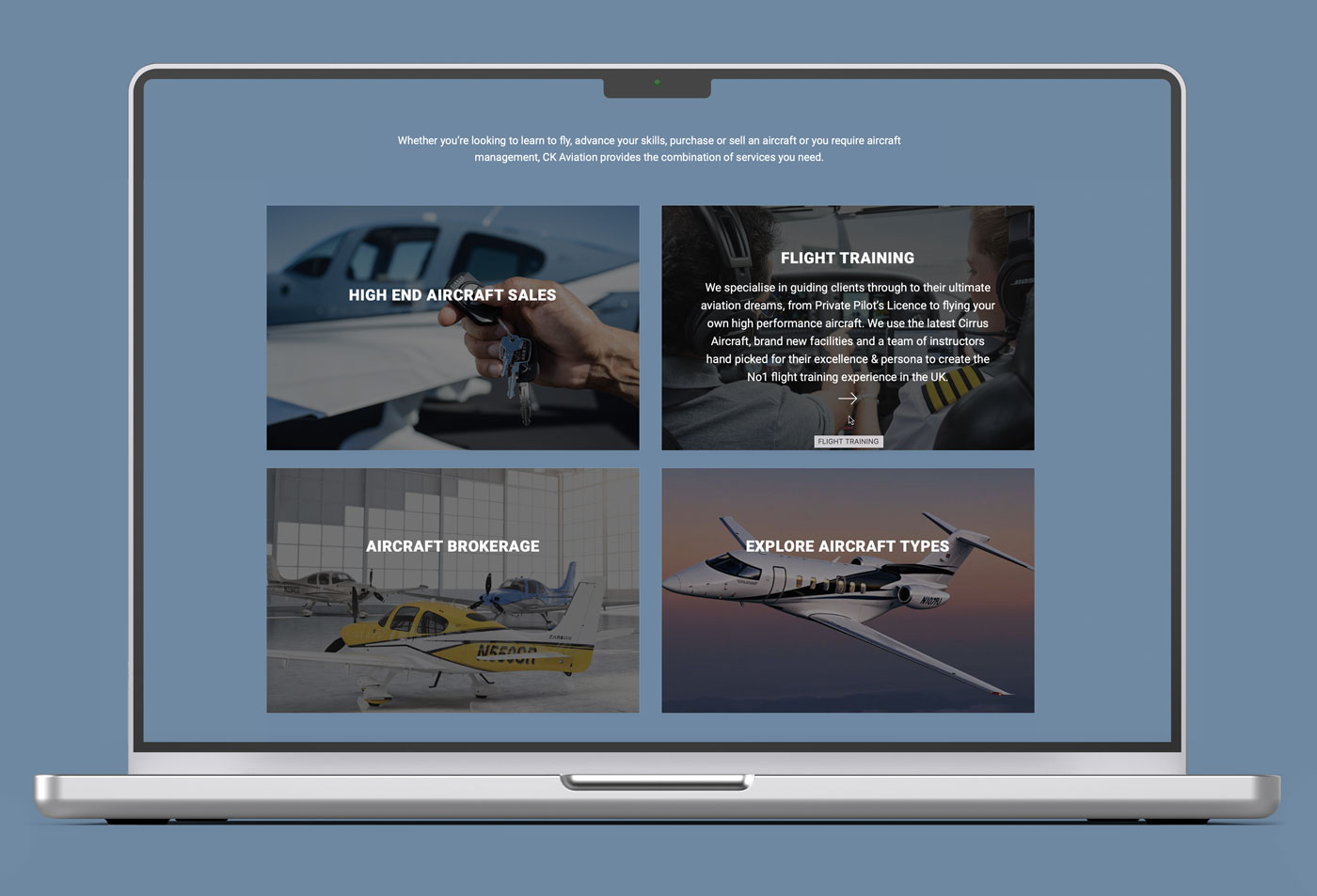
CK Aviation wanted a very clean header and for the users to read the information on the site which would then lead them on to other areas of the website. With their previous site there was no way of doing this. On the website homepage we created 4 sign posts to key areas, when hovered with the mouse a brief synopsis of where the link was taking the user on their journey.

Aircraft Website Design
The signposts above followed on for use on the training page. The previous website had one single page for training, this meant one page with a lot of information for the user to digest, with 6 different training programs to read. However we made a suggestion that each training programme should have its own page, this created a better user experience with each training programme correctly laid out with the finer details and the use of additional images. It also meant the website was more search engine friendly, as the individual pages could now be prompted.
Aviation Mobile Website Development
The website was recoded in several areas to make sure it was fully mobile responsive as many of the CK aviation users would be on the move and a high percentage would be using the website on a mobile or tablet device.
View our other work
Slide across to check out some of our other design and development work


